The New Logo / Jersey Speculation | Page 27 |

The New Logo / Jersey Speculation

Do you like the Logo?


  • Total voters
    40
  • Poll closed .
Status
Not open for further replies.
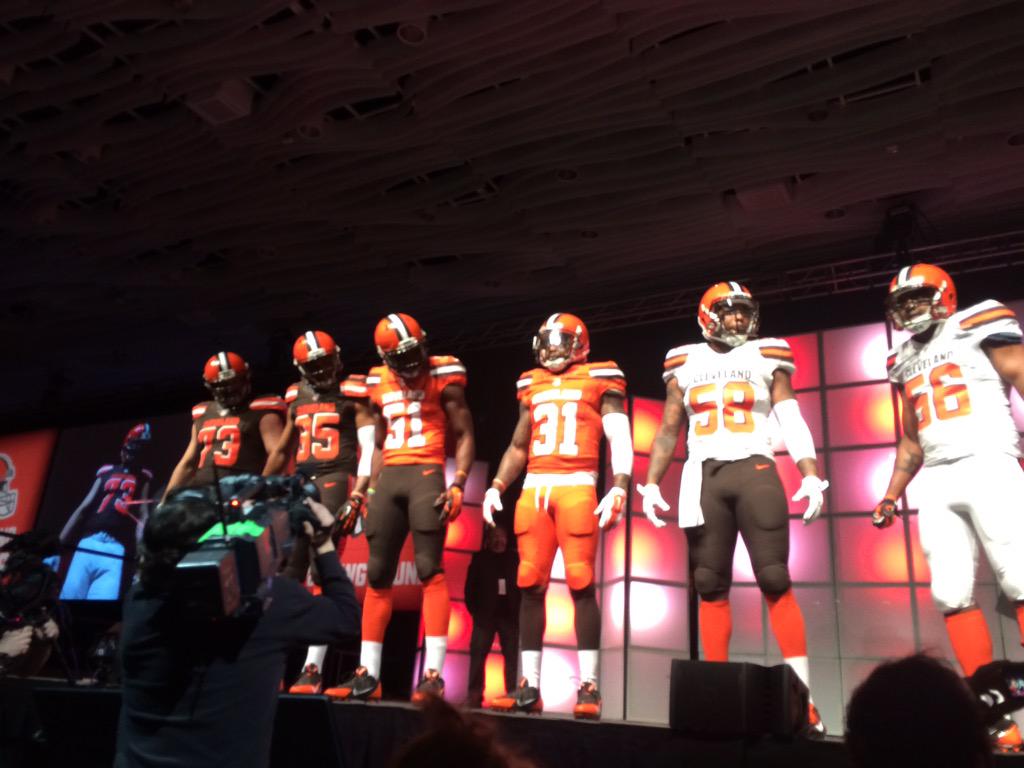
They had the orange on orange front and center.. and they kept pushing the orange on TV.. I think the orange on orange is the new primary..

Its also what I hope.. lol

temp041415-uniform-022--nfl_mezz_1280_1024.jpg
 
Agree with Joe Thomas. All orange is hideous. The all brown is alright. Not sure I like the Browns block letters on the legs.

Is the Brown color darker than usual?

I don't know ...I am not overwhelmed, but it's not totally horrible either. Brown and orange is nice too.

The color on my tv was messed up somehow and I couldn't tell if the Brown was Brown or dark gray, I about shit bricks for a minute.
 
Last edited:
I think it looked darker than usual but I can't tell if it was the lighting in the room.

The brown doesn't look as dark in the photos to me. I don't know though.
 
i could do without the cleveland across the front that big and the brown face mask sucks but thats the only negative i can come up with
 
The lighting on the live feed was atrocious. The gallery is SO much better. Also, in the gallery the brown outs have brown socks, which is way cooler and less blocky. I like'em. You know, except the orange jerseys or all orange (!).

I do like the brown up, orange down... which I didn't in the Sipe years.
 
Status
Not open for further replies.
Back
Top Bottom