The New Logo / Jersey Speculation | Page 29 |

The New Logo / Jersey Speculation

Do you like the Logo?


  • Total voters
    40
  • Poll closed .
Status
Not open for further replies.
The uniforms are fine. But the whole production and release sure did come off as a fiasco.

I hope the draft goes smoother than the release did.
 
Word this morning is it wasn't the Browns who messed up the release, it was Nike. The same thing happened with Nike's last uni release (Jacksonville?).

I'm loving the numbers on the orange and white jerseys as the outlining is more subtle there. Still unsure about the numbers on the brown jerseys.

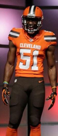
I'm giving this a 9 out of 10 as they stretched it as far as they could. I now feel gray would have been over the top for too many fans. I might even go 10 out of 10 as I can't think of what else they should/could have done. I was worried they wouldn't go far enough after the botched "new logo" marketing - but they swung for the fence, and I like that.

I'm also happy we're moving on back to draft talk. :)
 
What kind of potato was WEWS using to film the red, err, orange carpet walk-in? I turned it on and had to shut it off after five minutes because neither pixel was viewable with any decent quality.

Gotta say, I'm not a fan of them. I do like the brown with orange numbers though. I was looking through a uniform history site and saw they had that only once, the 1984 preseason. I was hoping to see something like it somewhere. I want to see the orange ones shipped back to 2004 and left there. Not big on the whites really. I think those would look better with the old orange instead of this construction zone shade they have now.

Favorite to least favorite: Brown/Orange, Brown/White, White/Brown, White/White, White/Orange, Orange/Brown, Brown/Brown, Orange/Orange, Orange/White.
 
Last edited:
Word this morning is it wasn't the Browns who messed up the release, it was Nike. The same thing happened with Nike's last uni release (Jacksonville?).

I'm loving the numbers on the orange and white jerseys as the outlining is more subtle there. Still unsure about the numbers on the brown jerseys.

I'm giving this a 9 out of 10 as they stretched it as far as they could. I now feel gray would have been over the top for too many fans. I might even go 10 out of 10 as I can't think of what else they should/could have done. I was worried they wouldn't go far enough after the botched "new logo" marketing - but they swung for the fence, and I like that.

I'm also happy we're moving on back to draft talk. :)

I like the Orange numbers on the Brown Uni's because it's a throwback to the Paul Brown days...which I think is cool.
 
Looks like the helmets are techinically "satin" rather than "matte", which explains the differing opinions on it's finish. I'm just so glad they modernized the shit out them.

I think I may repaint my spare bedroom in Pantone 2018c.

041415-infographic-web-980.jpg
 
Last edited:
The Brown Jersey and Orange Pant just comes across as menacing. I love it. Hope they use that combo early and often.
 
Am I the only one who likes them all?

I think the best thing we can take away from uni changes are the pants.
Specifically, the ORANGE pants.

They are all kinds of awesome to me. Plus the Browns text, it is just vibrant and appealing to me, fresh.
Imagine Benjy or Gilbert taking one home in these, they will look awesome on the field.

The ones I really like is White/White pants, Brown/Orange pants and White/Orange pants, and not to forget, the Brown Brown combo.

With what we had to work with and given the expectations of some, I think that it was done well.
The one thing I really think fucked it up a bit, was the overhype, apparently because of Nike.
And I think the shoulder patch is a tad too big.

And I 'm sure it would have been better to go with Gilbert, Desir, Bito, generally the younger guns rather than Bowe, Hartline.
Thomas is a must given he is a HOF lock.

Cheers,

Ziggy
 
Last edited:
I may like the Orange Jersey and Brown Pants better than the ALL Orange.. But the all orange is still badass.. so it the white.. and so is the brown jersey orange pants.. Really, ALL the combos look really good.

CCowEUWXIAAbNQf.jpg:large
 
Honestly, as long as the new unis included orange pants being back, I knew I was going to love them. These are, without a doubt, our best jersey's in the history of the Cleveland Browns. I absolutely love them and will not miss the old, boring Cleveland uniforms.

Also, the more I look at them, the more I love the pants.
 
Honestly, as long as the new unis included orange pants being back, I knew I was going to love them. These are, without a doubt, our best jersey's in the history of the Cleveland Browns. I absolutely love them and will not miss the old, boring Cleveland uniforms.

Also, the more I look at them, the more I love the pants.

I have to agree with our member ABF here. They all look good.

My fav is brown top orange pants.

least fav is the orange orange (sorry QCT/Clemson) and brown brown.

The white/white is very fine as it upholds tradition.
 
Last edited:
Looks like the helmets are techinically "satin" rather than "matte", which explains the differing opinions on it's finish. I'm just so glad they modernized the shit out them.

I think I may repaint my spare bedroom in Pantone 2018c.

041415-infographic-web-980.jpg

Great pic here. Staying true to its roots has been paraphrased many times, and there are some haters out there. In doing so, Cleveland really did place the fans first with the whole uniform. I saw a lot of smiles last evening...even Haslam was caught smiling.

I like the Browns on the pantleg, " Cleveland " front and center, and the Dawg Pound sewn on the inside collar. An all orange combo will help on bad weather days...if needed? My humble thoughts are a solid B+ bumped up to an A based on the design parameters (e.g. what the fans wanted, history & lineage). And, the Columbus leak isn't seen as a big deal to me; the event was a huge success. Spreading the new logo, new uni's, FA selections and the draft out during the offseason appear to be sound decisions.

Go Browns!
 
Honestly, I think they're fantastic. The bold use of CLEVELAND front and center was a very cool idea. The colors look amazing. To each his own on a favorite combo (mine are anything with the brown jersey, love the all brown and brown/orange the best)... but I think they need a fantastic job. I'm all in.
 
Status
Not open for further replies.
Back
Top Bottom