The New Logo / Jersey Speculation | Page 28 |

The New Logo / Jersey Speculation

Do you like the Logo?


  • Total voters
    40
  • Poll closed .
Status
Not open for further replies.
MWHAHAAHA

@ SHEP


CCl-B3tUsAAgwcz.jpg


Wow, I like it. The Brown Pants and Orange Jerseys work well, too.

I really hated the all Brown pants with no stripes of recent years. I'm glad they put something there. Awesome that it's a partial stripe and the word Browns on the sides of the pants. Really, really cool, man. Really cool.

-Al
 
Seriously, everyone somewhere between liking them and loving them. I'd say 90% of us are, which is not a bad sampling.

How hard is that to do? Damn Nike, I'll be stupefied you did it.

It's super difficult to please the traditionalists and the turn-the-page crowd at the same time.

And we haven't even seen them in action, which will add the game-day emotion.

Kudos.
 
Uniforms....

They give us new uniforms how about they give us new style play like winning! Who cares about the uniform changes they should change the style of play (winning vs losing) rather then uniforms, I am not spending ANY more money then Sunday Ticket on this team until they do, they start putting a quality product on the field then we can worry about new uniforms. But there will be people lining up saying here take my extra money for the new uniforms for this inferior product.
Don't get me wrong I love the Browns, even more then I love the Buckeyes or Massillon Tigers, but I refuse to line the owners pockets but to the smallest degree that I have to (Sunday Ticket) until he starts giving me my moneys worth. I want the Super Bowl yes but right now I would settle for relevance and competing for the Division and Conference for now.

Signed fan who could care less about the emperors new clothes...
 
I've stewed on it for a bit. I give the redesign a solid 7/10.

Pro's: I love BROWNS on the pants, that's dope! I quite like that it says CLEVELAND on the chest as well. Who was it that made the argument many teams around the league are making the move to putting their names on their jerseys? Props to them.

Cons: Shadows on the numbers, man I just hate the numbers. That's the thing I really don't like the most. I also like that when you really boil it down, it's not really that much of a redesign.

I think I like the white jersey the best which is a shame because white is a cursed colour for me. I always spill something on myself when I wear it... so it would be like playing with fire. I don't mind the Brown, it's growing on me, but I do like the orange numbers/font. The orange, sorry PGL, but I'm just so horribly meh on the orange. Sign me up for the Brown jersey/Orange pants combo, that looked really sick.
 
Bravo! I just don't like them.mthey look like Arena league. The white socks go way up and the uniform is so tight. Ugly too.
 
Ok so here's how I'm feeling:

Brown/Orange combo is just gorgeous. Love it so much. Hope we see this a lot. 5 :D :D :D :D :D

Followed by Brown/Brown, White/White, and the Orange/Brown. Really like all of those as well. 4 :cool: :cool: :cool: :cool:

The White/Brown and Brown/White are good. Pretty standard. 3 :) :) :)

Not a real big fan of the White/Orange. 2 :( :(

The Orange/Orange is just bad. With the orange helmet, Thomas said it best: "Traffic Cone". Hope we never see that. 1 :mad:

But my love for symmetry appreciates the stripes. *suicide2*

The Orange/White is one I'm conflicted on. I like how it looks, quite a bit actually, but this is the combo that reminds me of Cincy too much. :confused2: :confused2: :confused2:

Basically, if we wear Orange tops, it should be with the Brown pants.
 
Last edited:
Looking them over more, I really like having Cleveland on the front. Though they just moved Browns to the pants, which I like. It's different without being too much. The stiching is really cool, especially on the brown jersey. Like the stripe. Still not a fan of the shadowed numbers but it doesn't look as bad as I feared.

All in all, great job.
 
shadowed numbers

Agree this is the only thing I'm a bit unsure about. I know Paul Brown's Browns had them, but that doesn't mean they were good or that he liked them. I think I would have preferred an even outline of white for the pop effect.

Having said that, next step is to see them on the field. I can't wait.

I guess the helmet IS matte finish, although some have questioned it due to the lighting in last night's photos.

The textured stripe is subtle enough to be cool but not ruffle the traditionalists feathers.

The players seem to love them, and Whitner claims that matters. I love the players digging them. Hartline living the dream. I hope we get the QB thing figured out. He and Whitner took less money to come here. Come Ray and Mike, get this thing right.

CCoR84eUwAAl7Op.jpg:large


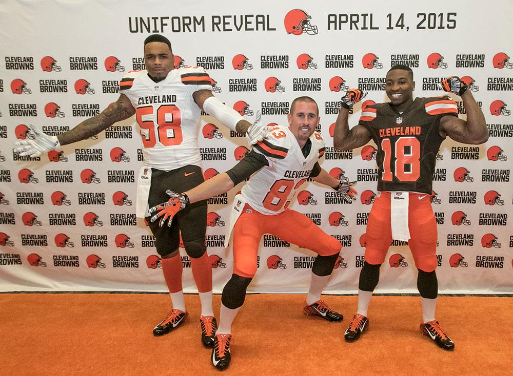
And really, they're pretty bad-ass

041415-Trio-CP1.jpg
 
Last edited:
Status
Not open for further replies.
Back
Top Bottom