The " Book It " thread! | Page 42 | Barking Hard

The " Book It " thread!

Okay, I am a data person and I can get hung up on stuff that nobody else would bother with. However, if someone can help me with a problem I can’t seem to solve, I would appreciate it.

The following graphs are for reported new cases per day, deaths per day and hospitalization in the United States for the period from April 4, 2020 to September 11, 2020. The graphs are from data collected into an Excel spreadsheet from two sources. The reported new cases and deaths attributed to Covid-19 are from “Worldometers” and the data for hospitalizations is from “The Covid Tracking Project."

Capture.JPG

The blue bars represent the number of reported new cases, deaths and hospitalizations and the red lines represent a 7 day running average for new cases and deaths. The data points noted below are based on 7 day running averages.

Data for the period prior to April 10th was not collected into the spreadsheet. However, this data can be observed in graphs for new cases and deaths in the “Worldometers” link shown and, similarly, the data for hospitalizations can be found in “The Covid Tracking Project” link.

However, the peaks for the initial surge in April are observable in the about graphs. Specifically, the initial peak for reported new cases per day was 32,639 which occurred on April 10th, and the overall peak for deaths was 2,256 which occurred on April 26th. In the recent surge, the peak of 69,336 new cases per day essentially doubled the initial peak of 32,839. However, the number of deaths which peaked at 1,177 on August 4 was about half of the prior peak.

The question is: how can this be rationalized?

Okay, we know that a significant proportion of cases are asymptomatic and it seems likely that in the early days of the pandemic, the number of cases may have been significantly undercounted due to this phenomenon. Since then, testing capacity has increased and with an emphasis on testing, it seems likely that a larger proportion of the actual cases have been captured in the count.

However, a problem remains. If the number of new cases per day during the earlier period is adjusted such that the two peaks for new cases have a similar correspondence with the number of deaths during the two periods, the number of cases per day during the early period would need to be adjusted to four times the number reported.

However, hospitalizations show the two peaks with essentially an equal number. Thus to be consistent with hospitalizations, the cases per day during the early period would need to be adjusted to only twice the number reported.

I have puzzled over this for the past couple of days and I can’t think of a way to rationalize this and it is bugging me. If someone could explain this apparent inconsistency, I would appreciate it.


Sweden had reported an accumulative 5,846 deaths attributed to Covid-19. That is 577 deaths per million. The proportion of death in the United States is slightly higher at 593 deaths per million.

Capture2.JPG

Fortunately for them, as you can see from the above graph, it appears that their pain from Covid-19 is essentially over. Reference graph from Worldometers.


However, it should be recognized that Stockholm, Sweden, is not exactly a significant transportation hub whereas we have several major transportation hubs with planes flying from dense areas of the country to the far reaches of the country. Plus in some of our major cities, we have millions of people being transported by subway each day. The Sweden experience is not applicable to a large diverse country such as ours. Not the same thing.
 
From April 12, 2009 to April 10, 2010, CDC estimated there were 60.8 million cases (range: 43.3-89.3 million), 274,304 hospitalizations (range: 195,086-402,719), and 12,469 deaths (range: 8868-18,306) in the United States due to the (H1N1)pdm09 virus.Jun 11, 2019
.

The obvious is we over 6 months have 7 million cases when testing 92 million. this covid is just worse. both spread over us. with our testing so high now, I doubt even more the number of 10x as many cases than we find. 3-5x makes more sense. that just adds up now too. Trump can use My data. 👨‍💼 🇺🇲
 
I've been looking for info on this for months. not so much about mask wearing part but Low viral load exposure.

I do question the part about asymptomatic infection. if one has enough viral load to test positive. that can not be Low viral load... you think ? I would think that would be medium/mild viral load. but I'm no doctor... yet.. but have done more reading the past 8 months.


I have a problem with the conflation of the two words: hypothesis and theory in an article that purports to be authoritative. And I have a problem with something being referred to as "only a theory" in any context. A hypothesis is merely an assumption or guess. However, a theory requires evidence in its support. There is a significant difference between a hypothesis and a theory.

Still, Dr Monica Gandhi, an infectious disease physician at the University of California, San Francisco, and one of the paper’s authors, has stressed that the commentary has its limitations and should not be construed as anything other than a theory.

“To test the variolation hypothesis, we will need more studies comparing the strength and durability of SARS-CoV-2–specific T-cell immunity between people with asymptomatic infection and those with symptomatic infection, as well as a demonstration of the natural slowing of SARS-CoV-2 spread in areas with a high proportion of asymptomatic infections,” she told the Sunday Telegraph.

In the absence of evidence, a hypothesis should not be referred to as a theory. An opinion that something might be the case is not evidence. Therefore, to make the article better, each occurrence of the word "theory" in this article should be replaced with the word "hypothesis."
 
Agree on = hypothesis and a theory

Surely not the total of all I would like to have on viral load exposure. yet seen little else new. new meaning last few months July forward.
This sites older and this year. yet not definitive.
Viral load: How much of the virus does it take to make us sick?

I don't see this link in "Face masks could be giving people Covid-19 immunity, researchers suggest" ..........maybe they just forgot it ? or not.
9-13-20

more
9-18-20
Some captain obvious in this. to avoid "Join wall" search this, then use the cached.
Does Virus Dose or Load Predict How Sick You Get With COVID-19?

the link will not work in this forum.
[/URL]

I must say I'm suffering from Virus reading fatigue at this point, the past 7 weeks really. so much regurgitation.
 
Last edited:
In a recent Senate hearing, Senator Rand Paul of Kentucky in a question to Dr. Anthony Fauci suggested that the reason for the current relatively low rate of infection in New York City is herd immunity.

Dr. Fauci objected saying that Paul was not listening to the director of the CDC who had mentioned that in New York, the positivity rate is about 22% and further suggested that if the Senator believed that a 22% positivity rate results is herd immunity, he believed that he would be alone in that.

Paul is a Senator with no specific expertise in anything while Dr. Fauci is a world renowned epidemiologist. Nevertheless, I believe that Senator Paul is basically right.

First, the Senator is not completely alone in believing that a 22% of a population having been previously infected provides significant protection in a heterogeneous model.

In a homogeneous model that assumes that everyone is alike in that regard, the percentage must be relatively high. However, it can be lower in a heterogeneous model that results from infection due to a disease since some members of a population will be more likely to get the virus than others whether due to circumstance or behavior.

The percentage in a heterogeneous model may be lower since some members of a population will be less likely to be infected with virus whether due to circumstance or behavior. People who work at home are as likely on average to seek vaccination as people who travel to work via a subway system. But in the case of people gaining the immunity via disease, people who travel to work on a subway system are much more likely to be infected than people working from home or traveling by private car to work. For this reason, some modelers have used 43% in heterogeneous models. Others such as Gabriela Gomes of The University of Strathclyde have used 20% as the threshold for herd immunity.

How herd immunity happens, and will it protect us from coronavirus?

Further to the arguments presented in the article, I would mention that herd immunity is not a policy to be pursued. Instead it is a natural epidemiological phenomenon. It is simply the case that when relatively large numbers of people are infected by a disease and are therefore naturally immune from said disease, it reduces further infection.

By definition, herd immunity represents a reduction in the risk of infection with a specific communicable disease (such as measles or influenza) that occurs when a significant proportion of the population has become immune to infection so that susceptible individuals are much less likely to come in contact with infected individuals.

Finally, we can look at the New York experience itself to look for evidence. On March 16, New York state shut down along with the rest of the nation after the federal government issues new guidelines which were said at the time to be for the purpose of flattening the curve.

At that time, New York had 235 reported cases. A week later, with all nonessential workers sent home, the number of news cases rose to 2,862 per day. After two weeks while shut down, the number of news cases rose to 6,875 per day. After three weeks while shut down, the number on new cases rose to 9,432 per day. On April 10, nearly four weeks after the shutdown, the 7 day average reached 10,052 new cases per day of the coronavirus after which the number of reported new cases started declining. It eventually dropped to the 800-1000 range where it has remained for the past four months.

The question is whether the eventual decline was a result of the policy that led to the shutdown or was it because a significant number of subway riders (many of whom were probably asymptomatic) became infected and the virus began to find it increasingly difficult to find uninfected people to infect. (Kind of like the law of diminishing returns for the virus.)

I tend to the latter view. I believe that social distancing is effective and I support the wearing of masks when social distancing is not possible and particularly inside public buildings such as grocery stores where ventilation may not be perfect. But I think the shutdown was basically ineffective and I also think that continuing the shut down (which is still occurring in some states) is not justified by the science.
 
ASSESSING THE AGE SPECIFICITY OF INFECTION FATALITY RATES FOR COVID-19: META-ANALYSIS & PUBLIC POLICY IMPLICATIONS

Andrew T. Levin Kensington B. Cochran Seamus P. Walsh Working Paper 27597 Assessing the Age Specificity of Infection Fatality Rates for COVID-19: Meta-Analysis & Public Policy Implications NATIONAL BUREAU OF ECONOMIC RESEARCH 1050 Massachusetts Avenue Cambridge, MA 02138 July 2020, Revised July 2020

As the COVID-19 pandemic has spread across the globe, some fundamental issues have remained unclear: How dangerous is COVID-19? And to whom? The answers to these questions have crucial implications in determining appropriate public health policies as well as informing prudent decision-making by individuals, families, and communities.

As shown in Table 1, assessing the IFR for COVID-19 is analogous to finding a needle in a haystack, especially in a dense urban area such as New York City (NYC). The New York State Department of Health recently conducted a large-scale seroprevalence study and estimated the NYC infection rate at about 22 percent, that is, 1.6 million out of 8 million NYC residents.1 As of mid-July, NYC had about 220,000 reported COVID-19 cases, almost exactly one-tenth of the total number of infections. About one-fourth of those reported cases were severe enough to require hospitalization, many of whom unfortunately succumbed to the disease. All told, fatalities represented about one-tenth of reported cases but only one-hundredth of all infections.

 
Another Covid month has gone by and life goes on it seems. The following graphs are for reported new cases per day, deaths per day and covid hospitalization in the United States for the period from May 11, 2020 to October 10, 2020. The graphs are from data collected into an Excel spreadsheet from two sources. The reported new cases and deaths attributed to Covid-19 are from “Worldometers” and the data for hospitalizations is from “The Covid Tracking Project."

It will be observed that the number of infections is again ticking up nearing 50,000 per day. However, the number of deaths associated with Covid seems to be continuing on a downward path and the current 7 day average for deaths in the US is 711. If the trend continues, it should be below 500 per day by the end of the year.

Corona update charts.JPG

However, hospitalizations are increasing again and that may be an ominous sign. It is likely that we will know the results of the election before we learn the next turn of this deadly virus.
 
The reason I don’t buy in to all these graphs and stats is because there is evidence that they simply aren’t accurate and in some cases downright fraudulent.

I met someone a while back who was not happy when a friends daughter was killed in an auto accident, and it was attributed to COVID-19.
 
The reason I don’t buy in to all these graphs and stats is because there is evidence that they simply aren’t accurate and in some cases downright fraudulent.

I met someone a while back who was not happy when a friends daughter was killed in an auto accident, and it was attributed to COVID-19.
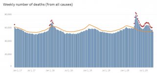
Troph, there is no doubt in my mind that the data contains significant errors with respect undercounting of the number of infections and misappropriations of deaths. There is good evidence that the number of infections may be as high as 10 times the number reported and the number of covid deaths should be described as "associated" with Covid as opposed to "caused" by Covid. Nevertheless, there is no doubt that the major portion of deaths associated with covid were actually the result of Covid. the following is a graph provided from the CDC which shows the excess deaths during the Covid period:

Capture Excess.JPG

Troph, there have been as significant increase in the number of expected death this year and those excess deaths did not occur in a vacuum.
 
Top Bottom